Vox Media / The Verge / 2022
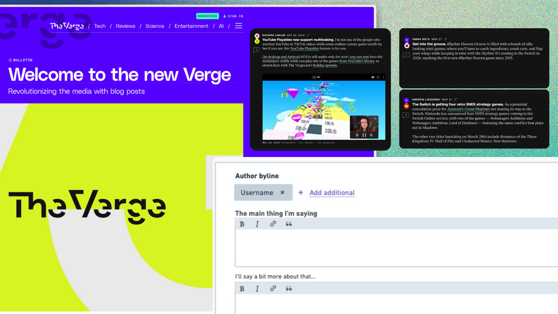
Make It Feel Like Posting
Designing a short-form publishing surface inside Chorus so The Verge could bring fast, voice-driven updates onto its own homepage without losing the structure of a real CMS.
I designed Quick Posts, a purpose-built composer inside Chorus, Vox Media's shared CMS for brands including The Verge, Vox.com, Polygon, SB Nation, Eater, and New York Magazine. The work was not to make a lighter article editor. It was to create a publishing surface that helped writers post quickly while the platform still handled the parts readers never see.
Role
Principal Product Designer
Embedded from Coral on Editorial Tools tools during The Verge's relaunch window.
Collaboration
PM, engineers, editorial leadership
Partnered across CMS and audience product teams during a public relaunch window.
Platform context
Shared Vox Media CMS
Chorus powered major Vox Media properties while composition moved from Ractive to Vue.
Overview
The challenge was a new editorial rhythm inside an old publishing posture
About the product
Quick Posts was a new short-form entry type inside Chorus, Vox Media's CMS for properties including The Verge, Vox.com, Polygon, SB Nation, Eater, and New York Magazine.
The challenge
The Verge wanted more fast, voice-driven posts on its own site. Chorus was built around article production, so even short updates inherited the mindset and weight of a full CMS workflow.
My design response
I advocated for a purpose-built composer instead of a stripped-down article editor, then shaped the MVP around fast authoring with the platform still handling routing, metadata, embeds, and moderation hooks.
The hardest part was not drawing the composer screen. It was getting everyone aligned on what kind of object a Quick Post was.
Where I came in
Stepping into the Editorial Tools team during a coverage gap
As a Principle Product Designer, I was asked to join the Editorial Tools team from Coral during a moment when the team needed design coverage. The team had operated without a dedicated designer for a few months but the Verge re-launch required dedicated design attention. My Coral work had moved into performance improvements, technical configuration, and the design system and configuration patterns I established allowed me to oversee the Coral work while shifting my attention to Quick Posts and other editorial tooling work.
That mattered because Chorus was not a side system. It was the CMS editorial teams relied on every day, and the relaunch work depended on new functionality inside it.
Quick Posts was one part of that need. Other editorial tooling work, including experiences around live stories and related publishing workflows, also needed design attention.
How I developed context quickly
Met with The Verge editorial leadership to understand the new homepage and editorial ambition.
Understand what Chorus already assumed about content, undestand how the current design system was being used.
Met with Editorial Tools PM to understand the team's current priorities, how they typically collaborate, and what success looked like for this project.
Talk with engineers about how they previously worked with designers, what they cared most about in their work, and learn about how they approach design handoff.
Review Editorial Product Experience designs they finalized with Verge editorial team to understand the visual language and necessary inputs that created the Quick Post experience.
Alignment problem
Quick Posts touched more than one team's definition of success
Quick Posts did not begin as a simple Editorial Tools request. The Verge editorial team had already collaborated and finalized designs with the Editorial Product Experience team on what Quick Posts would look and feel like on the redesigned homepage.
Editorial Tools then had to answer a different question: how does a writer actually create one of these inside Chorus?
Alignment map
Team
The Verge editorial team
What mattered
A homepage that felt alive, timely, and voice-driven.
Authoring implication
Quick Posts needed to feel more like posting than filing an article.
Team
Reader-facing product experience design
What mattered
How Quick Posts appeared in the new homepage stream.
Authoring implication
Chorus needed to support the visual and editorial intent of the homepage designs.
Team
Editorial Tools PM
What mattered
Scope, reliability, CMS fit, and launch timing.
Authoring implication
The authoring model needed to stay focused and shippable.
Team
Editorial Tools engineers
What mattered
Implementation quality inside Chorus during the Vue rewrite.
Authoring implication
The design needed reusable primitives, not a fragile custom surface.
Design translation
Connect homepage ambition, CMS rules, PM scope, and Editorial Tools engineering constraints.
Working authoring model
A composer that fit the homepage goal, the CMS rules, and the implementation path
My role was to connect those concerns and drive alignment around a model that supported the desired output without overcomplicating the authoring experience.
It was not an article. It was not a tweet. It was structured CMS content that needed to feel like posting.
Mental Model Insight
The CMS was setting the writer's mindset before they typed
When I joined the team, the original proposed path was to clone the existing article editor and hide the irrelevant parts. That would have saved some build time, but it would not have changed the feeling of the work. A writer opening Quick Posts needed to feel like they could share a thought, not publish a smaller article.
The most stark difference I noticed when I joined Editorial Tools from my work on Coral was how my experience working with comments felt so different from writing articles, but that difference actually became the largest asset I could bring to the team and project.
The homepage needed a new supply line
The reader-facing strategy depended on a steady stream of short posts from Verge writers. If the authoring tool felt heavy, that strategy would collapse back into Twitter and Slack.
A smaller article editor was still an article editor
Removing fields from a long-form composer would not change the writing posture. The surface needed to invite a thought, not a miniature story package.
The platform was moving underneath us
Chorus composition was being rewritten from Ractive to Vue while Duet was replacing the front end. The design had to serve the relaunch and fit the future stack.
System model
The editor was only one node in the publishing system
Quick Posts looked simple on the surface, but each entry still had to behave like real Vox Media content. It needed a byline, a URL, a group, a publish state, a home in the Storystream, and enough structure for downstream systems to understand what had been published.
Conceptual Quick Posts system
Writer-facing need
Write a quick thought
Chorus still had to handle
Create a structured entry.
Design implication
Design a composer, not a reduced article editor.
Writer-facing need
Add a reference
Chorus still had to handle
Support images, links, and embeds.
Design implication
Limit the model so the post stayed focused.
Writer-facing need
Publish quickly
Chorus still had to handle
Preserve publish state and routing.
Design implication
Keep the fast path visible and lightweight.
Writer-facing need
Place the post correctly
Chorus still had to handle
Connect to groups, authors, URLs, and homepage surfaces.
Design implication
Use compact controls and sensible defaults.
Writer-facing need
Maintain editorial trust
Chorus still had to handle
Preserve metadata and downstream system requirements.
Design implication
Let the platform do serious work without making the writer manage all of it.
The goal was not to remove complexity from Chorus.
The goal was to keep complexity from becoming the writer's starting point. If too much CMS structure appeared upfront, writers would feel like they were filing an article. If too much structure disappeared, the post would not behave like real Vox Media content.
Decision 01
Design a composer, not a reduced article editor
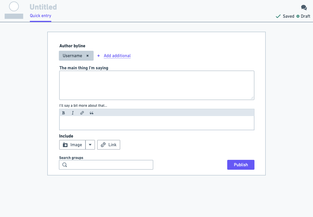
The core model was two fields. The primary field invited the thought: "What's on your mind?" The secondary field let the writer "say more" with a small set of formatting options. That split created the hierarchy the homepage needed without forcing every post to become a headline plus article body.
With an article editor the width of the editor would be much wider to appropriately mirror writing a long-form article. Similar to writing a document, that width creates a thinking space for the writer to focus on their content. Quick Posts needed a different approach. The width of the composer was designed to be compact and constrained, allowing the writer to focus on their content without distraction.
Product move
A separate short-form composer with language and layout tuned to posting.
Tempting shortcut
Clone the article editor and hide fields that Quick Posts did not need.
Why it mattered
The article editor carried the wrong posture. The goal was not less CMS. It was a different kind of publishing moment.
Decision 02
One attachment kept the post from becoming a package
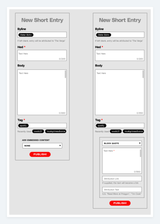
Under the old model of the Chorus article editor, writers could add images, links, and embeds within the flow of their writing; however, Quick Posts needed to limit this to only one. Originally, the proposed direction was that there would be publishing guidelines that writers would have to keep in mind to limit the attachments to just the one that they were wanting to reference; however, that meant that the writers were going to need to manage that themselves instead of staying in the flow and spirit of what quick posts were supposed to be all about. The user experience wouldn't actually be in the hands of the product but rather in the hands of the writers themselves. Which defeated the point of Quick Posts. Ideally, the composer could automatically recognize a link and and embed, but that was beyond the scope of what could be built in time. From that posture I was able to successfully advocate for a more product-driven approach with attachments: one image, one embed, or one link.
The homepage Quick Post designs showed 10 different attachment types which was beyond the scope of what the Editorial Tools could realistically build by the launch. Working with Verge leadership, and the Engineering and Product manager from Editorial Tools, we narrowed it down to three attachment types: one image, one embed, or one link. A Quick Post could include one image, one embed, or one link. That limit was not just scope control. It made the writer choose the object of the post and kept the composer out of full-article territory.
The attachment rule carried product and system meaning:
Image
A visual post could lead with one piece of media instead of becoming an article gallery.
Embed
A tweet, YouTube video, or other supported embed could be the object of commentary.
Link
Internal Verge links and external links could carry different presentation rules without exposing that complexity first.
Product move
Allow one image, embed, or link as the object of the post.
Tempting direction
Support every homepage variation directly in the composer.
Why it mattered
The composer needed enough flexibility to support the homepage vision, but enough constraint to keep Quick Posts from becoming another article workflow.
Decision 03
Let the product need evolve the design system
Quick Posts exposed a limitation in the existing Chorus design system. The available components had been shaped around long-form editorial workflows, but this story type needed to feel lighter, more flexible, and more direct.
The Vue rewrite turned a constraint into an opening
Existing constraint
Rigid article-era components
The system had been shaped around fuller editorial workflows.
Product need
A lighter composer
Quick Posts needed controls that supported short text, optional context, and one attached object.
System opportunity
A reusable Vue primitive
The rewrite created room to improve the authoring model instead of forcing a new story type through old patterns.
This was the design system work inside the product work: use the feature to move Chorus toward authoring patterns that could better support different editorial behaviors.
Product move
Advocate for a flexible authoring primitive during the Vue rewrite.
Too narrow
Treat Quick Posts as a one-off surface with bespoke controls.
Why it mattered
The relaunch needed speed, but Chorus also needed patterns that could survive past one brand launch.
Outcome
The composer helped make the homepage strategy operational
47%
increase in loyal users after The Verge relaunch, cited by The New Yorker
Company-reported metric
15%
overall readership increase from January to September 2023, reported by Adweek
Adweek
Quick Posts was not the whole relaunch. The public-facing change was a more active, voice-driven homepage. The hidden dependency was an authoring model that made those posts practical for writers to create inside Chorus.
The broader relaunch was later associated with stronger reader engagement, including company-reported increases in loyal users and overall readership. I would not frame Quick Posts as the sole cause of those results. I would frame it as enabling infrastructure: the authoring tool that helped the editorial rhythm become possible in daily practice.
Reflection
Publishing tools have a tone
A blank article editor asks for one kind of writing. It says: compose, package, polish, publish.
A posting surface asks for something else. It says: react, share, comment, move.
Quick Posts was about designing that difference into Chorus without pretending the CMS no longer mattered. The tool still had to produce structured content. It still had to respect the platform. But the writer's first experience needed to feel like posting, not paperwork.