Coral / Vox Media / 2016 to 2023
Signal, Not Verdict
Designing one of the first production integrations of Google's Perspective API as a moderation signal, not an automated decision-maker.
Coral helps newsrooms host and moderate public conversation. It began as The Coral Project, a collaboration between Mozilla, The New York Times, and The Washington Post focused on healthier online communities. During my tenure, I designed major parts of Coral's moderation experience: the queues, signals, workflows, and controls teams used to manage high-volume conversation across 120+ newsrooms, 23 languages, and 18 countries. This showcase focuses on one slice of that larger system: integrating Google's Perspective API into moderation workflows without letting AI make editorial decisions.
Role
Lead Product Designer
Sole dedicated designer for Coral's moderation experience across a larger multi-year product system.
Collaboration
Product, engineering, newsrooms, moderators, and engagement editors
I shaped the UX and product logic with Coral's cross-functional team, technical partners, and direct feedback from newsroom moderators and engagement editors.
Customers
Trusted media brands
Used by major news organizations, including The Wall Street Journal, Financial Times, The Verge, New York Magazine, and more.
About Coral
Coral's mission was to help newsrooms keep public conversation open while reducing harassment, abuse, and toxic behavior
A collaboration by Mozilla, The New York Times and The Washington Post, The Coral Project was a grant-funded initiative to build open-source tools that help newsrooms moderate online comment sections more effectively.
Scale without overcorrection
The goal was not to make speech more restricted by default
Newsrooms needed to keep public conversation open while reducing harassment, abuse, and toxic behavior. The goal was to protect the conditions that made good conversation possible.
The risk was not only letting harmful comments slip through. It was also making moderation so fast, defensive, or automated that it removed legitimate participation.
Coral needed to help moderators find and review risky comments more efficiently without turning uncertainty into over-enforcement.
The design challenge
How might we help moderators find and review risky comments faster without letting automation, speed, or uncertainty become over-enforcement?
Why this mattered:
- Move too slowly, and toxic threads can escalate before moderators intervene.
- Move too aggressively, and legitimate participation can be removed simply because it looks risky at first glance.
- Rely too heavily on automation, and a probability score starts behaving like a verdict.
To keep conversation open without overcorrecting, Coral needed more than one kind of moderation signal.
Moderator judgment
Moderators were deciding whether a comment belonged in a specific conversation, at a specific moment
Moderators reviewed comments under real operational pressure. The work was not simply identifying bad language. Moderators were deciding whether a comment belonged in a specific conversation, under a specific publication's standards, at a specific moment.
That meant reviewing the text, the parent comment, surrounding thread, author history, site policy, and whether the discussion was beginning to turn. The interface needed to make that review faster without pushing moderators toward the safest or most restrictive choice every time.
What I learned:
Context, not just labels
Moderators needed to see surrounding conversation, policy signals, and participant history before deciding.
Speed and judgment are related
The interface could reduce scanning burden, but it could not turn nuanced decisions into simple flags.
The restrictive choice is not always right
A safer-looking workflow can still erase legitimate participation if it treats uncertainty as enough evidence.
System model
AI was one signal layer in a broader moderation system
Coral's mission was not to make newsrooms more restrictive. It was to help them keep public conversation open without letting harassment, abuse, or bad-faith participation turn into a complete dumpster fire.
That meant the moderation system needed more than one kind of signal. Some tools handled specific terms. Others helped surface tone, hostility, or conversational risk that a word list would miss.
Perspective became one signal in that broader moderation system, not the system itself.
How moderation signals worked together
01
Site and story settings
Whether commenting was open
Let newsrooms control where conversation should happen.
02
Trusted-user rules
Authors who could skip review
Avoided slowing down known good participants.
03
Banned words
Specific terms that should not appear on a site
Handled clear policy violations quickly.
04
Suspect words
Specific terms that may be harmful depending on context
Sent gray-area language to humans instead of automatically blocking it.
05
Perspective toxicity score
Tone, hostility, or likely toxicity that word lists might miss
Surfaced risky comments that did not rely on obvious banned language.
06
User reports
Live comments readers believed needed review
Helped moderators respond to harm already visible on site.
07
Moderator decision
The final judgment
Kept editorial and community standards in human hands.
The moderation interface had to make these signals useful without making them feel like automatic verdicts. The selected decisions below show how I designed priority, uncertainty, and intervention inside a larger moderation system.
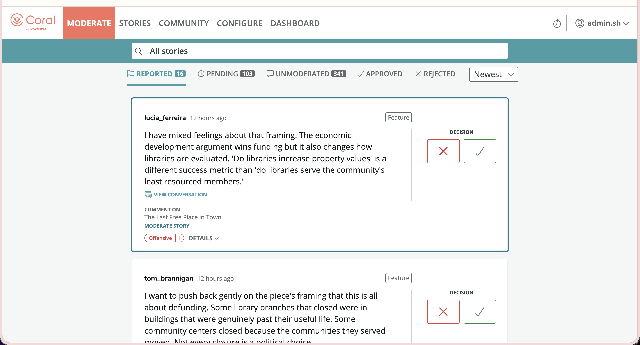
Once the system had multiple signals, the first design question was priority: what should moderators see first?
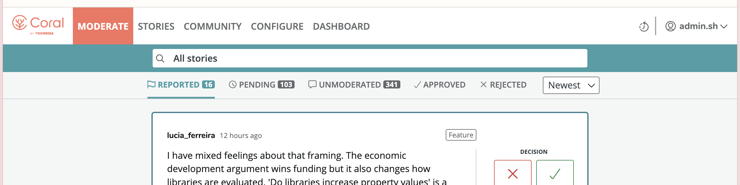
Decision 01
Queue order encodes urgency
The order of the moderation queues was opinionated in that it pointed moderators to what needed their attention most urgently.
Reported comments were already live. Pending comments had not been published yet. Unmoderated comments had passed through and were waiting. Those states carried different risks, so I designed the queue order to carry that priority for the moderator.
This was moderation system design, not AI design. It established the priority model that AI signals would later plug into.
Queue order encodes urgency. Left is live on site. Right is already resolved.
Reported
Live on site
Reported by community members or containing problematic language, these comments were highest urgency because they'd been identified by readers as harmful or offensive
Pending
Premoderation, not live
These were comments that were held back from being published for language or tone. Wait too long and speech would be stiffled.
Unmoderated
Published, not reviewed
Lower urgency
Approved / Rejected
Already actioned
Comments that had already been reviewed and approved or rejected
Product judgment
Opinionated queue order. The interface tells moderators where attention is most urgent.
Tempting alternative
Pure filter flexibility. Let moderators sort anything, every time, with no default point of view.
Why it mattered
A flexible tool can still push judgment back onto the person using it. Moderators had enough judgment work already.
Priority told moderators where to look. The next question was what kind of risk each comment carried.
Decision 02
From terminology to tone
Before integrating Perspective, Coral already gave newsrooms configurable tools for language moderation.
Banned word lists handled terms that should not appear on a site under any circumstance. Suspect word lists handled terms that might be acceptable or harmful depending on context.
That distinction mattered because language is not universal. A reclaimed term in one community could be harmful in another. A phrase that looked harmless in one space could be used as coded harassment in another.
But word lists could only catch known terminology. They could not reliably catch the tone, hostility, or escalating energy of a comment that avoided obvious banned language.
Perspective filled that gap as a signal layer. It helped surface likely toxicity that rules-based tools might miss, while still routing judgment back to moderators.
Signal distinction:
Banned words
Clear terms a newsroom chose to block by policy.
Suspect words
Context-dependent terms routed to human review.
Toxicity signal
Tone, hostility, or likely conversational harm that word lists might miss.
This distinction mattered because the goal was not to block more speech by default. The goal was to help moderators find the comments most likely to damage the conversation while preserving room for context, community norms, and legitimate disagreement.
Word lists could identify language. Perspective helped surface behavior.
Decision 03
The toxicity signal should not arrive with verdict energy
Perspective returned a probability. The card had to communicate that without asking a moderator in the middle of a queue to stop and interpret machine learning.
The design problem was not simply showing the score. It was showing uncertainty with the right visual weight.
I put the signal below the comment, used outline tags instead of solid alarms, and highlighted suspect words inline so the moderator could see why the flag fired.
Verdict energy
ToxicSuspect Words
A solid warning at the top of the card makes the machine's assessment arrive as a conclusion: heavy, decided, hard to look past.
Signal energy
ToxicSuspect Words
Outline tags below the comment make the flag visible, while keeping the judgment with the moderator.
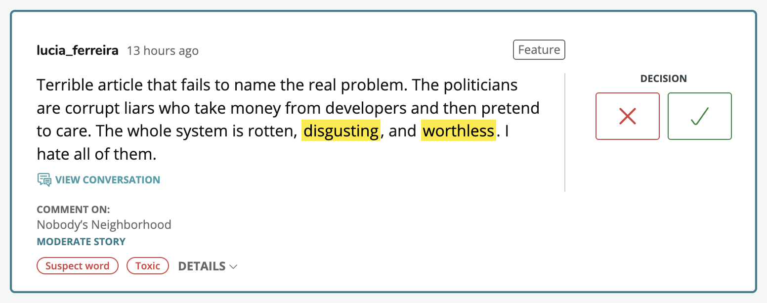
Signal
Outline tags below the comment, with inline word highlights for context.
Verdict
A solid warning at the top of the card, before the moderator reads the comment.
Why it mattered
A probabilistic score should not speak with more certainty than it has. The moderator needed the signal without inheriting the machine's conclusion.
For moderators, the signal supported judgment. For commenters, it had to create a moment of reflection.
Decision 04
Commenters needed a nudge, not a punishment
A moderator is reading to judge. A commenter is writing to participate.
For commenters, the design problem was not independent review. It was creating a moment to reconsider without silently suppressing speech.
When a comment crossed the toxicity threshold, the commenter saw an inline warning. They could edit the comment or submit it for moderator review. If they chose to submit, the comment was not automatically rejected. It moved into human review.
Warning and confirmation states
!
Are you sure?
The language in this comment might violate our community guidelines. You can edit the comment or submit it for moderator review.
✓
Your comment has been submitted and will be reviewed by a moderator.
The warning, annotated
"Are you sure? The language in this comment might violate our community guidelines. You can edit the comment or submit it for moderator review."
"Are you sure?"
Framed as reconsideration, not accusation.
"might violate"
Mirrors the model's uncertainty.
"submit it for moderator review"
Makes clear that a human, not the system, makes the final call.
Intervention
One chance to reconsider. The commenter can edit or send the comment to a human moderator.
Trap
An endless re-checking loop that keeps nudging until the model score drops below a threshold.
Why it mattered
An endlessly nudging system becomes a game to beat. Good-faith commenters can also get trapped in a correction cycle they did not deserve.
Proof and broader validation
The durable pattern was not a Coral UI detail
The durable pattern was the product principle underneath: AI routes attention, humans keep the call.
Later research and industry examples supported the same underlying pattern: nudges can reduce toxic language, and AI moderation works best when treated as a signal rather than a final authority.
36%
of warned commenters edited their comment to reduce toxicity
McClatchy controlled study
34%
of nudged users edited after the warning
OpenWeb, 400,000 comments, 50,000 users
96%
reduction in very toxic comments
The Southeast Missourian
These proof points are presented as broader validation of the pattern, not all as direct Coral-owned product metrics.
The durable lesson was bigger than the API integration: uncertain signals should improve human decisions, not replace them.
Reflection
What this work still shapes in how I design AI-assisted systems
This project continues to shape how I design AI-assisted systems.
Show uncertainty
A probabilistic system should not speak with more certainty than it has.
Give people context
Human judgment only works when the interface shows the surrounding conversation, policy signals, and risk.
Make decisions traceable
If a system withholds speech, someone should be able to explain which rule, signal, or person shaped the outcome.
Preserve human agency
Automation can route attention, reduce workload, and help people reconsider. But in high-context systems, the product should be clear about where machine assistance ends and human judgment begins.
Takeaway
This work was not about inventing AI moderation
It was about integrating an uncertain machine signal into a human moderation system without letting the signal become the verdict.
It demonstrates how I design complex systems under real-world constraints: preserving judgment, supporting speed, and making product behavior legible across users, operators, and organizations.